Client: Birger N. Haug
Workplace: Dunderverk AS
Year: 2015–2016
My role
I was responsible for the visual lift of the brand, together with the marketing manager at Birger N. Haug.
The work included:
A new logo and visual identity.
A design manual and profile rules.
Applying it to letterhead, business cards, email signatures, campaign templates and digital surfaces.
Advice on how to implement the brand and look after it.
Approach
We started by analysing the existing profile and deciding which visual values had to continue.
I developed a new concept from the core of the brand: quality, safety and professionalism. That became a visual system with a clear identity and flexible use.
Everything was structured in a digital design manual, so the organisation could manage the identity consistently.
The solution
The new identity consists of:
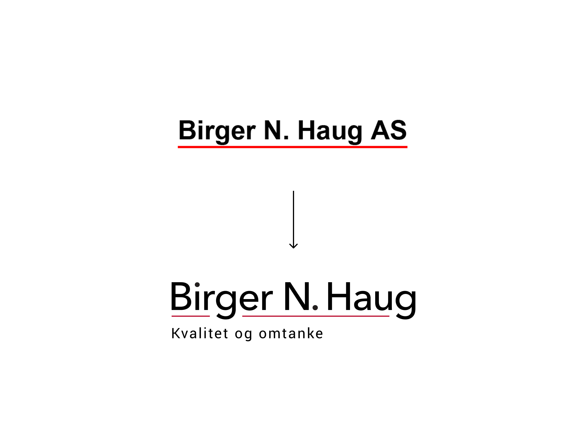
A redesigned logo, rooted in the original expression.
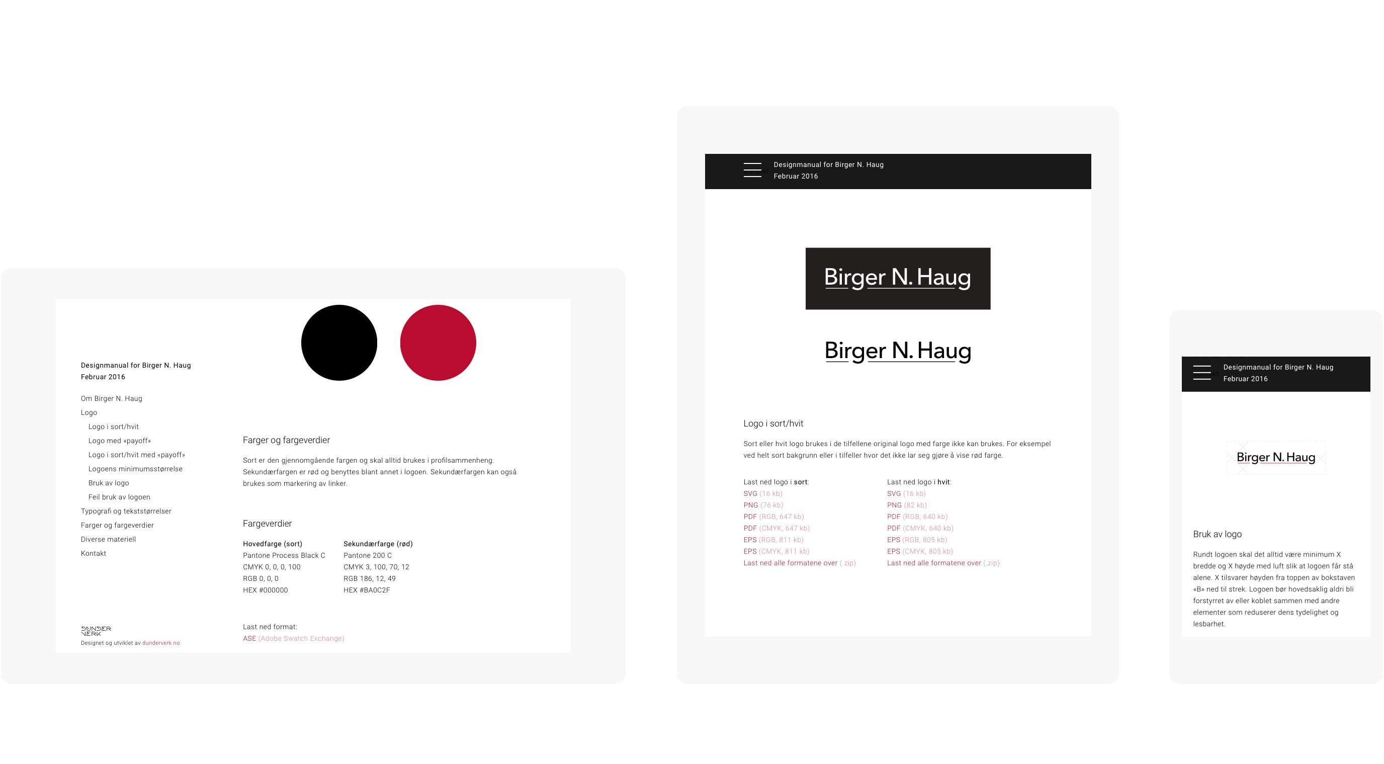
A clear system for colour and typography.
Templates and elements for marketing material, internal communication and digital surfaces.
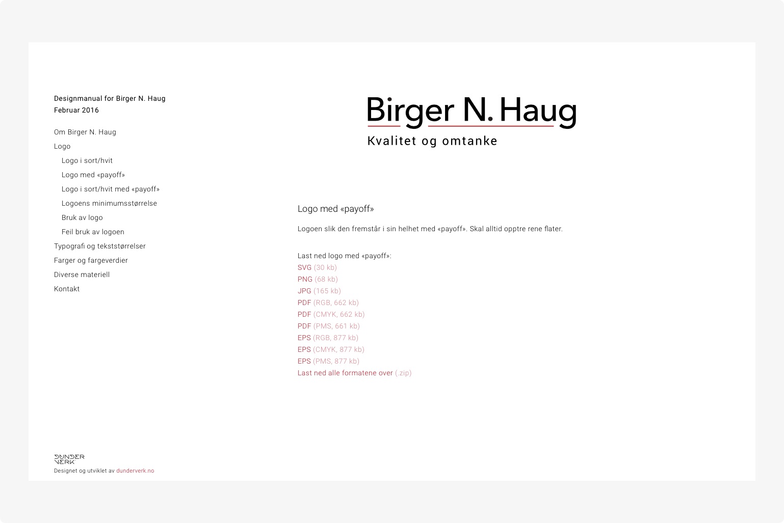
A digital design manual with an overview, a direction, and files to download.
It makes the brand recognisable, and it makes communication easier to keep consistent across departments and channels.
Result
Birger N. Haug now has a clearer and more consistent brand, internally and externally.
The digital manual gives better control over how the profile is used, and saves time in the daily production of material.
I am glad to have helped build a visual foundation that strengthens the brand with customers and partners.
Disciplines
Visual identity
Logo design
Design system and templates
Brand management
Typography and colour
Digital design manual
Visual communication
Design for print and digital surfaces
The logo in use on the Birger N. Haug website.
Pictures