Client: Dapper Oslo
Workplace: Dunderverk AS
Year: 2015
My role
I redesigned the visual identity for Dapper, in close work with the founders.
The work included:
Concept and logo.
Visual expression and colour.
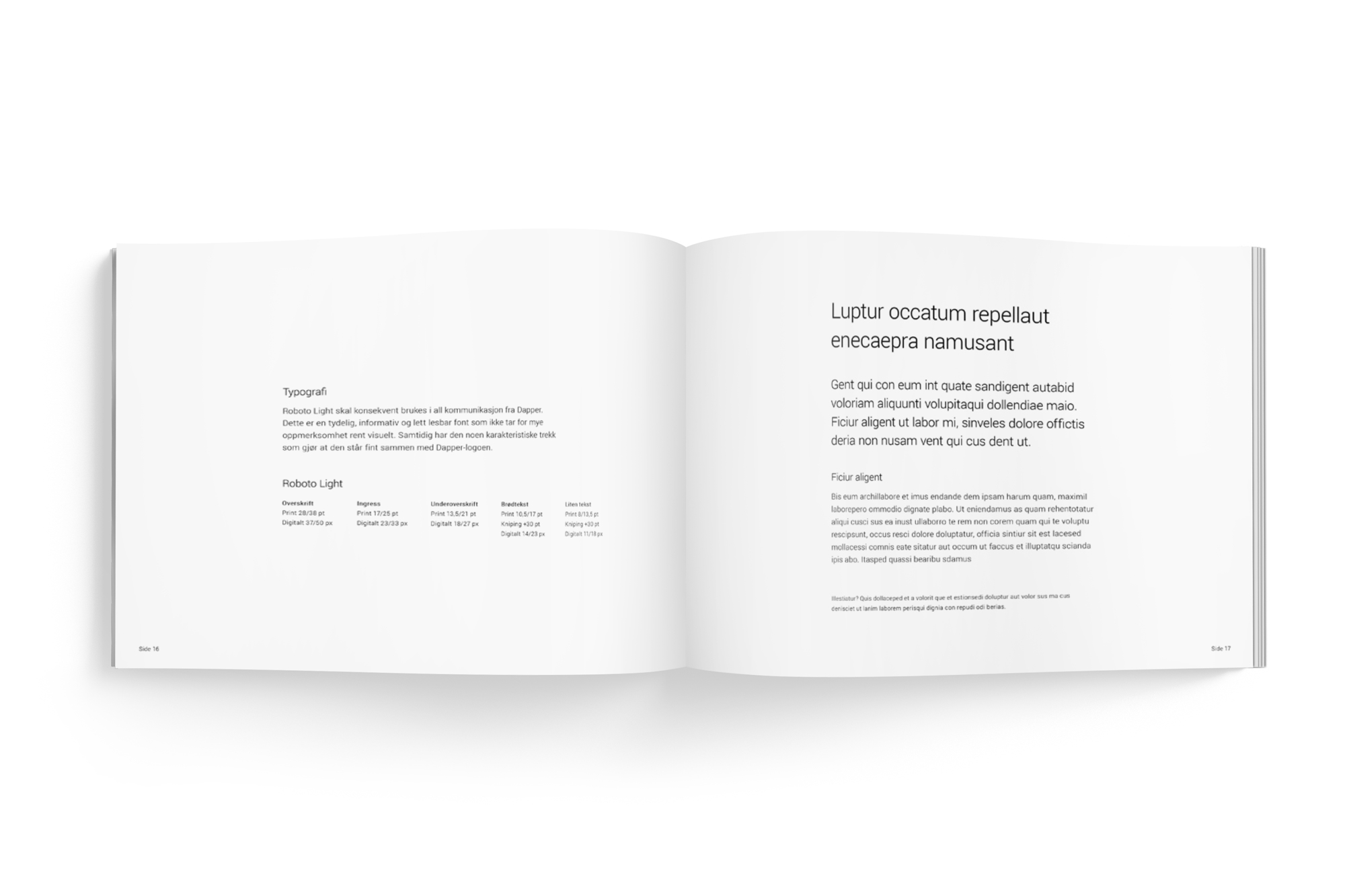
Typography and stylistic direction.
Design for print and for digital surfaces.
Approach
We started with Dapper's history, values and audience, and talked about how the brand should be read from then on.
I worked towards an expression that could hold the modern and the classic, the crafted and the urban.
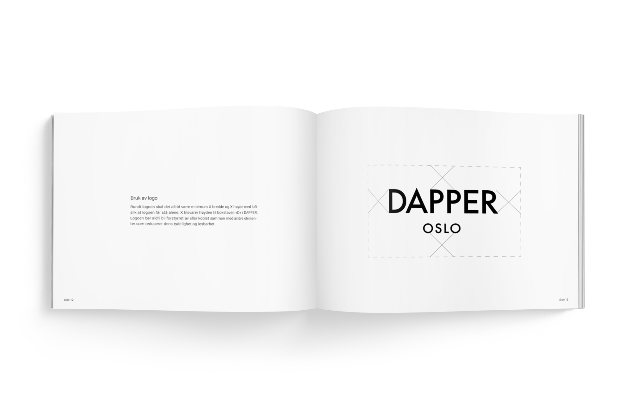
The logo and the identity were made to be recognisable, durable and flexible, from the shop sign and the packaging to ads and the web.
The solution
The identity is sober, and still particular:
A typographic logo drawn from classic letterforms.
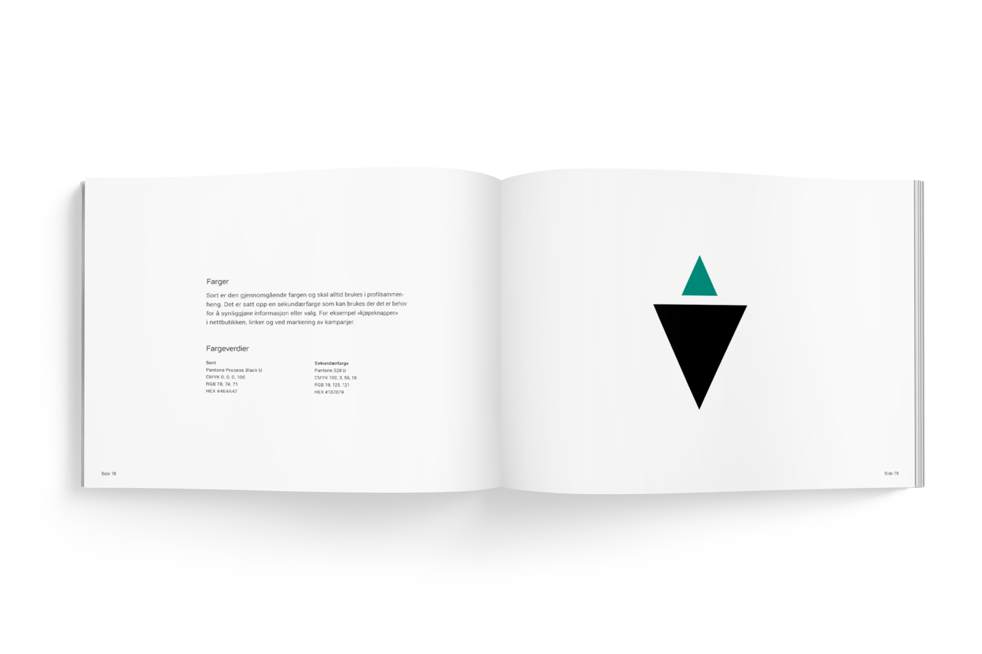
Shades of black, grey and a deep green, for depth.
One visual line for print and digital.
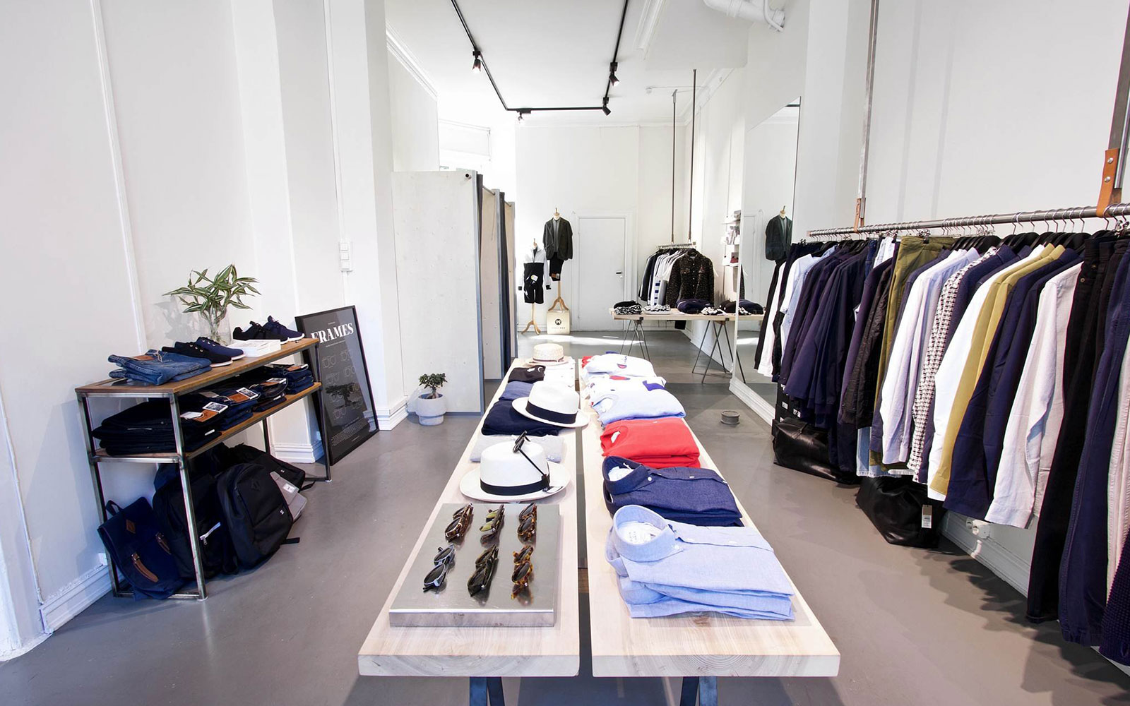
Easy to use in the shops, on the website and in social media.
It works both as the sender and as a frame for Dapper's visual world.
Result
The new identity gave Dapper a clear and consistent expression, which supports the brand's credibility and its growth.
It is easier to communicate the same way across channels, and the identity has become a tool for positioning Dapper in a crowded lifestyle market.
I am glad to have given Dapper an identity that can last, and that still feels like itself.
Disciplines
Visual identity
Logo design
Typography and colour palette
Design for print and retail
Design for digital surfaces
Strategic design
Visual communication
The logo and the identity are also used on the website, here.