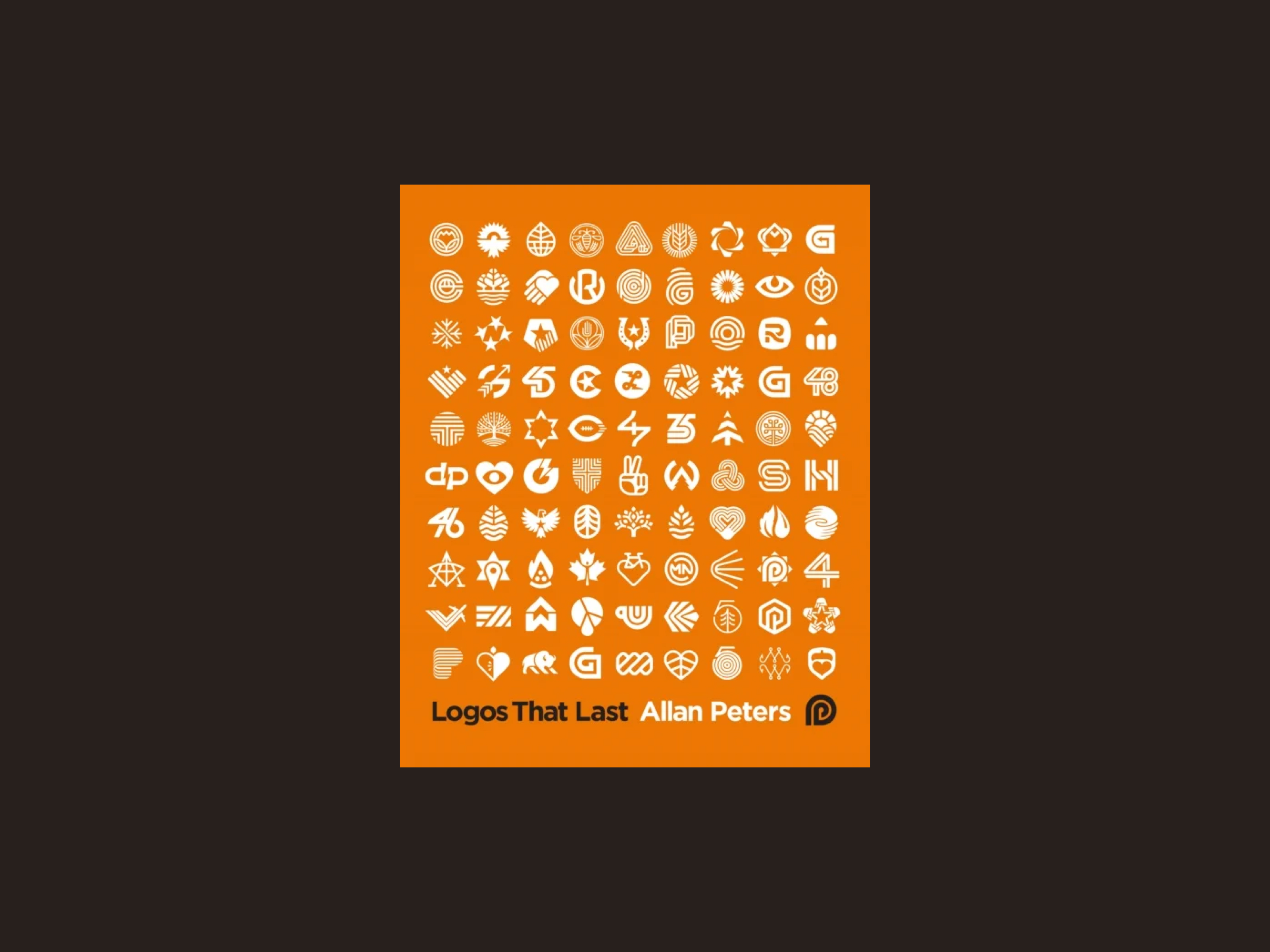
A logo should not be replaced because fashion moved
Peters' starting point is simple: a brand should not need a new logo every five years just because the style has dated. Marks like the Nike swoosh have held because they are built on something more stable than a trend.
That rhymes with what I have written about design that lasts: simple is hard, and decoration ages faster than function. The logo is the smallest expression of that idea.
You do not control everything
Peters splits what decides whether a logo lives long into two parts. Three things sit outside you.
Time. Good marks get stronger when people have seen them for a long time. Bad ones fade.
The marketing budget. Repetition makes a mark stick. You do not always choose how often it is shown.
The quality of the product. A handsome logo does not save a weak product. A brand is more than the mark, as I wrote in A brand is not a logo.
It is useful to say this out loud in a project. You can draw a clear mark and still not decide whether it gets time, visibility and a product that holds.
What you can control
The rest is the craft. Peters points to seven things you can actually influence: commitment, visual beauty, originality, function, colour, how easily the mark is remembered, and simplicity.
Do not treat them as a checklist at the bottom of a presentation. They are questions you can ask along the way.
Do I care enough about the brief to look further than the first solution I think is good enough?
Does the mark stand when you take the explanation away?
Could someone else already own this shape?
Can it be read as an icon, on an invoice, and on a dark background?
Does the colour carry the story, or is it just this year's palette?
Can you draw it after seeing it once?
Have you simplified until the mark still has an idea, and stopped there?
Simplicity has a stopping point
This is the sharpest point in the book, and the one I expect to use most.
A logo has to be simple to work. A circle or a square is simple, and easy to forget, because everyone else has one too. Originality and simplicity pull in opposite directions. Peters' advice is to remove elements until the story, the beauty, or what makes the mark memorable starts to weaken. Then you have gone one step too far. Go back.
That is the opposite of “can you make it even cleaner?”. Cleaner is not always clearer.
From many sketches to one system
The process in the book is to make a lot, and then choose.
Start with words, not shapes. Which nouns describe the organisation before you draw? Make many sketches, on paper. Combine ideas. Look for one move: a negative space, a geometric form, a detail that can carry the mark alone.
Do not stop at the logo. Peters wants the geometry to continue in pattern, icons and typography, so the mark is recognised even when the logo is small. It is the same thought as in The Brand Gap: the design should make the strategy visible, not only decorate it.
How to take it into the next project
Say what you do not control: time, budget and the product. A logo cannot carry that alone.
Write five to ten words before the first sketch. If the word cannot become a form, it is too vague.
Draw more bad sketches than you usually do. The first sketch that looks nice is rarely the one that lasts.
Test it in one colour, at a small size, and without the name beside it. If it cannot take that, it is not finished.
Simplify until the idea gets weaker. Then draw the line.
Build one system around the mark, not a folder of variants that do not resemble each other.
In short
Logos That Last is a book about logos, and the lesson is larger. Duration is a choice you make from what you can actually control: simplicity, a particular character, and a mark that can bear being used. Time, money and the product have to be in place for the mark to become known.
If you want a logo that can stand longer than the campaign, that is where I would start. Get in touch if you want to talk about it.